Year
2020
Roles
UX Research
Illustration
User Interface Design
Prototype
Tools
Adobe Illustrator
Adobe XD
Dump the Bump App
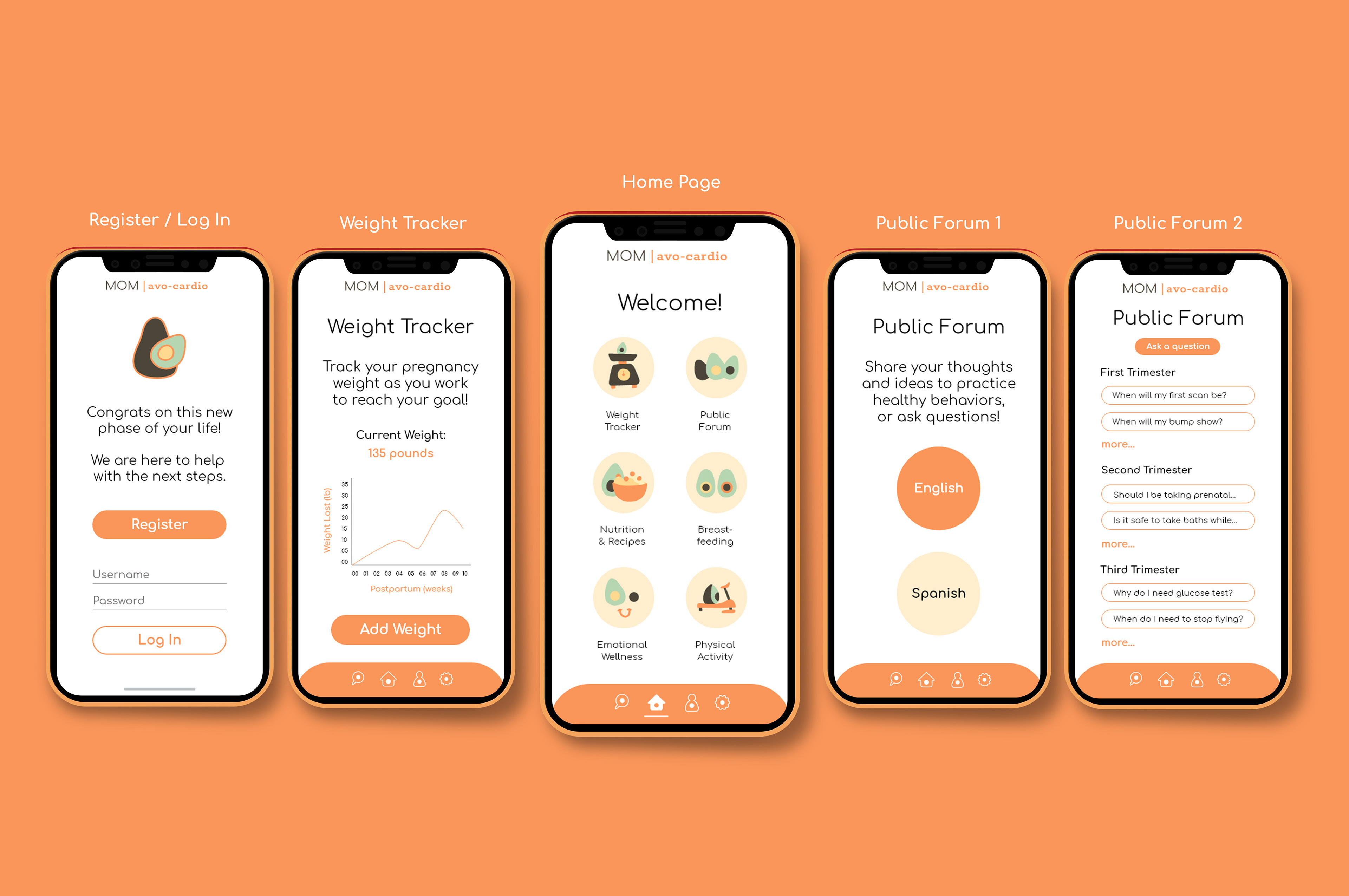
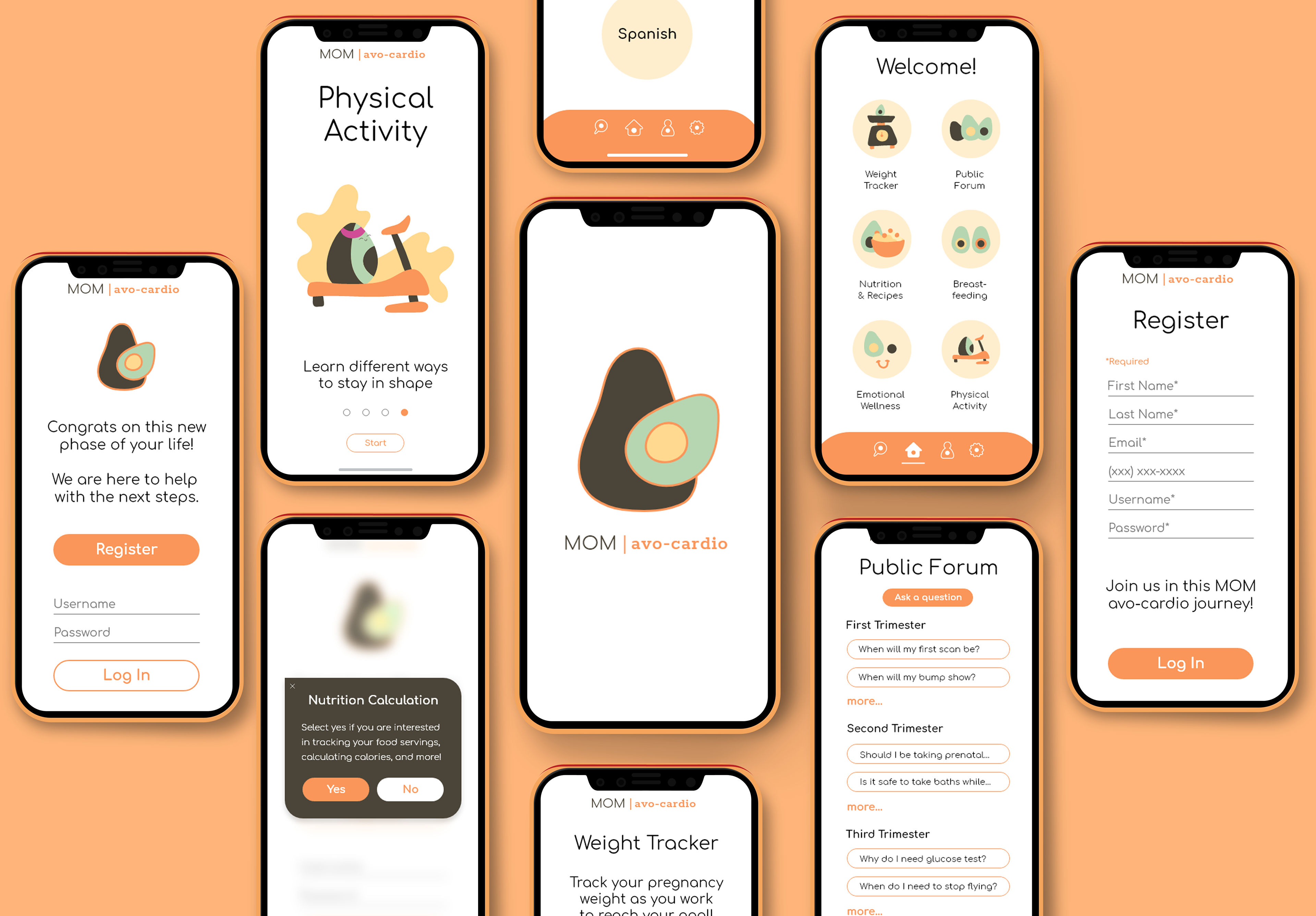
MOM | avo-cardio App
Purpose: The goal of this app is to help WIC (The Special Supplemental Nutrition Program for Women, Infants, and Children) moms lose weight after childbirth. Motherhood includes unique responsibilities that can make it difficult to prioritize weight loss. To make this app as helpful as possible, we asked WIC participants what would help them the most in their weight loss efforts after giving birth. However, once the app was created by a group of professors at Cal State Fullerton, students like me were asked to redesign this application for better user experience.
Background on the WIC Program
The WIC program is a special supplemental nutrition program for women, infants, and children. It provides supplemental foods, health care referrals, and nutrition education for low-income pregnant, breastfeeding, and non-breastfeeding postpartum women, as well as to infants and children up to the age of five who are found to be at nutritional risk.
Problems I Found During Navigation
1. "Dump the Bump" has negative connotations
2. Need to decide on a color palette;
3. Design elements need to be more uniform and cohesive;
4. Spacing, typography, placement;
5. Navigation icons can be designed in a more relevant way to pregnancy;
6. Work on hierarchy of type and elements;
7. Should have other sign-in options such as pregnant lady, partner, and guest;
8. Home page icons should have the same line weight;
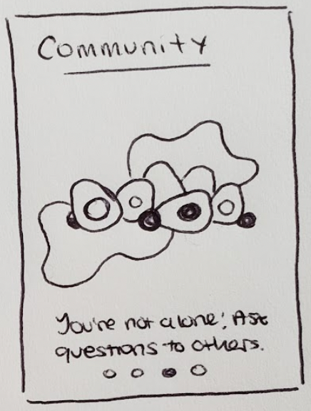
9. Community should be divided between languages;
10. Proofread questions in the forum;
11. Divide questions into sections so it doesn’t become a long list of unrelated questions;
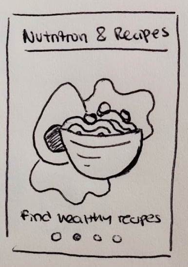
12. And perhaps include a diary section for the user to store photos and other entries.
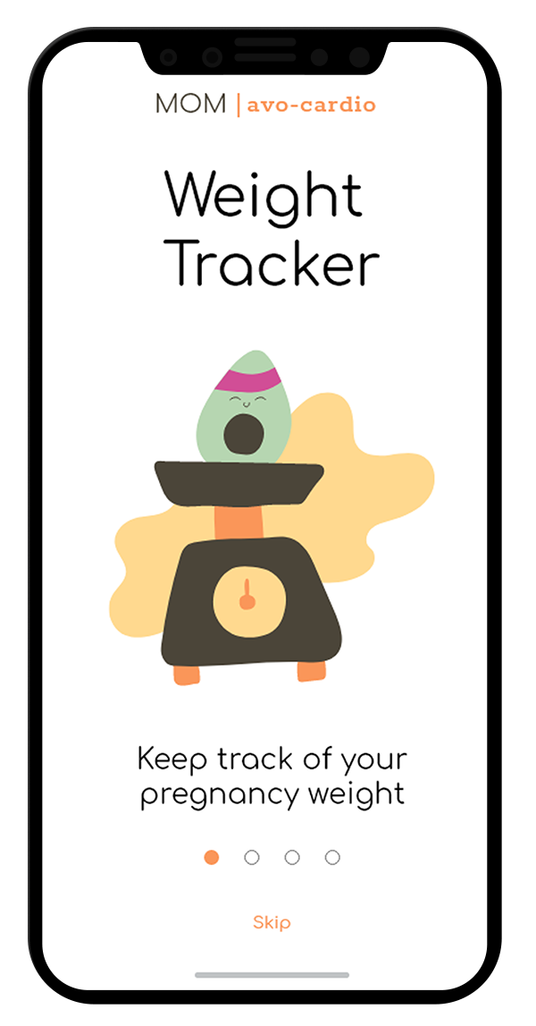
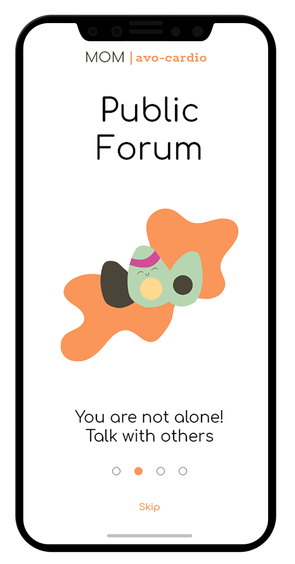
Two specific problems I will focus on: Weight Tracker & Community
Two specific problems I will focus on: Weight Tracker & Community
"Dump the Bump" App Feedback
After downloading the app that I was supposed to redesign, I screen recorded my navigation and included my feedback ideas to improve the overall user experience and design of the application.
Target Audience
The goal is to make this app easily accessible for stressed, soon-to-be mothers who need the ability to quickly and efficiently use an application for their own well-being. I want to appeal to their nurturing senses by using baby pastel colors and creating a friendly and welcoming user interface.
Desired Response
These postpartum mothers should feel welcomed to use this app without stress. The interface should be straightforward and simple for them to use and have their needs satisfied in a quick matter as they are very busy individuals with new responsibilities. By creating an attractive and fun app interface, these women should feel encouraged to track their weight and participate in the forums as a way to expand their community and better their health.
User Persona
I created a User Persona based on my mom to help me keep in mind the needs of a mother figure when using this app.
Clarisa Maman Orfali
Age: 47
Occupation: Software Engineer
Ethnicity: Hispanic/Latina
Status: Married with two kids (20 and 21)
Quote: "I'm very curious. I always have a lot of questions"
Occupation: Software Engineer
Ethnicity: Hispanic/Latina
Status: Married with two kids (20 and 21)
Quote: "I'm very curious. I always have a lot of questions"
About: When she was first pregnant, she had a lot of questions and fears so she joined a prepartum course while living in Argentina at 4 months pregnant. If it hadn’t been for the resources she had available, she would have been too stressed as a new mother.
Habits: When she lived in Argentina, Clarisa had a very active lifestyle.
- Commuted to work
- Walked to the library to study
- Cleaned the house
- Cooked lunch and dinner
- Moved around a lot
- Commuted to work
- Walked to the library to study
- Cleaned the house
- Cooked lunch and dinner
- Moved around a lot
Pain Points: When Clarisa was pregnant over 20 years ago in a third world country, there was no internet and way of receiving quick answers. She thinks having a forum is the most efficient way of calming down expecting mothers, especially if the forum topics are divided between trimesters to stay more relevant to what the woman is experiencing.
Goals: If she were to go through pregnancy again, Clarisa would use the app mostly for answering her questions and keeping track of her weight to see the journey of her pregnancy. She would like to see a once-a-week prompt to remind her to input her weight and also read about any extra precautions future mothers need to take during COVID-19.
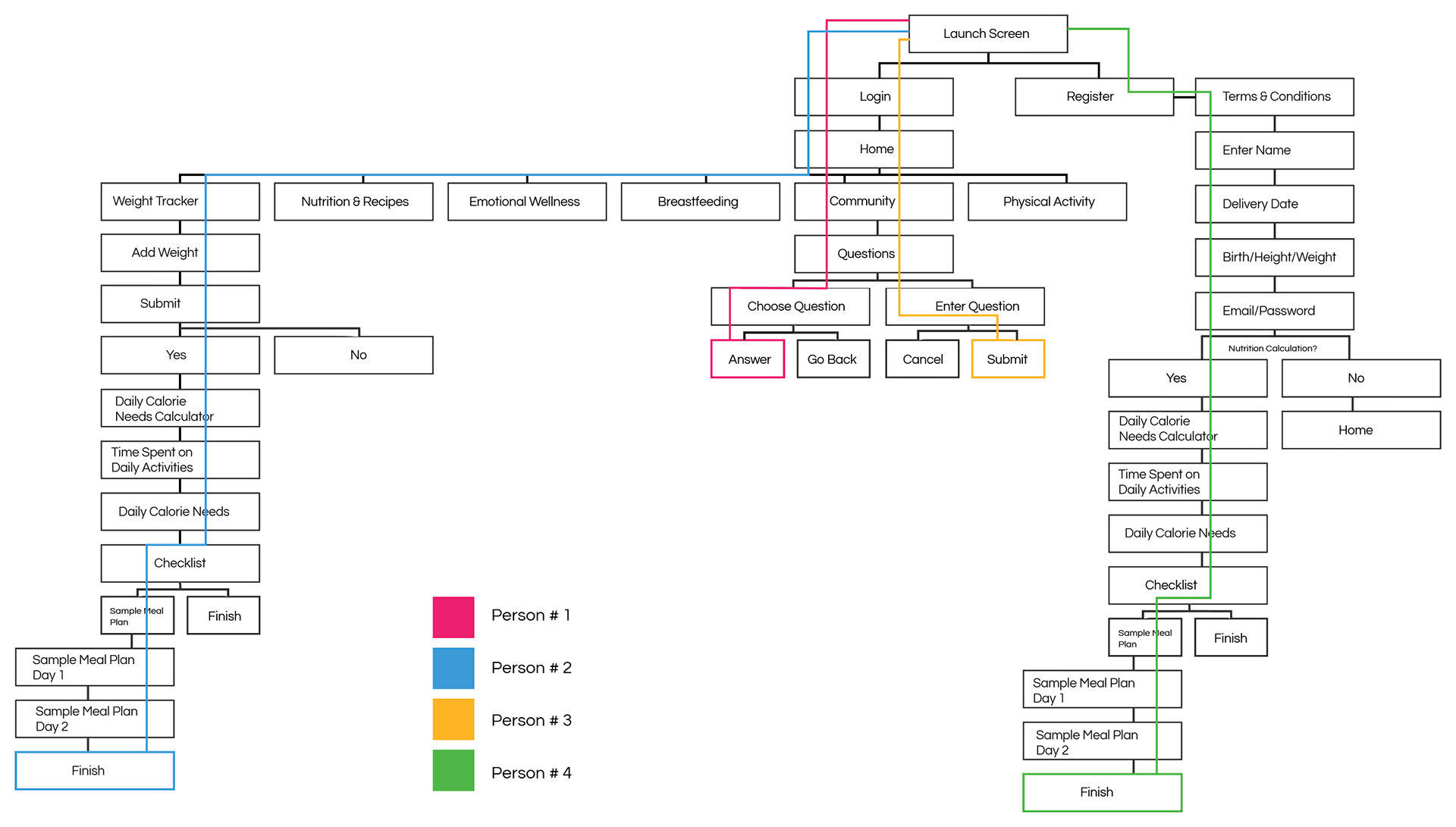
Current Sitemap
Current User Flows
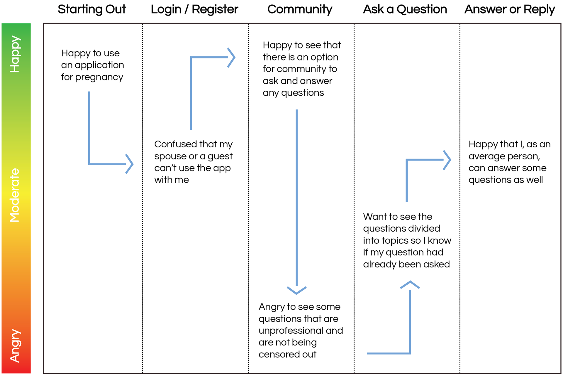
Current User Experience
As Clarisa navigated the app, I took note of her emotions while completing a specific task.
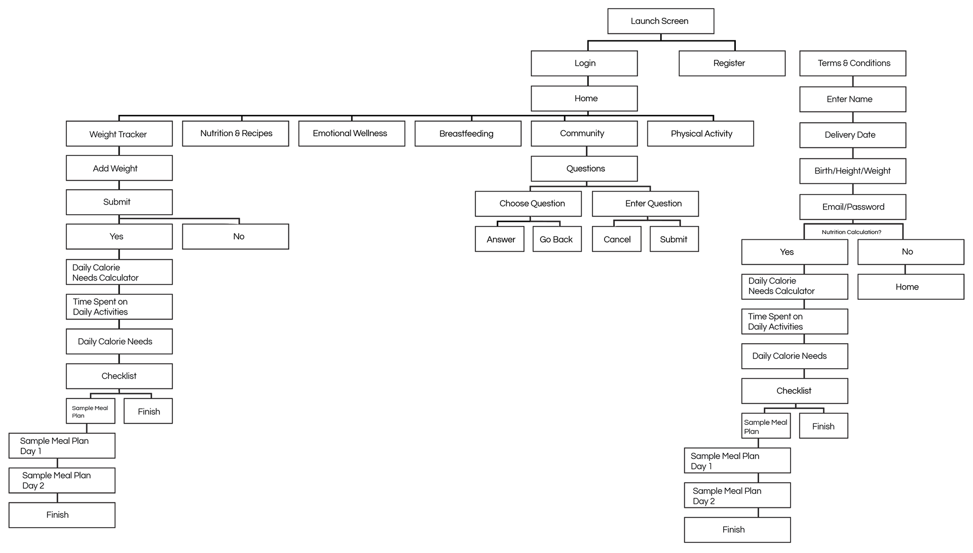
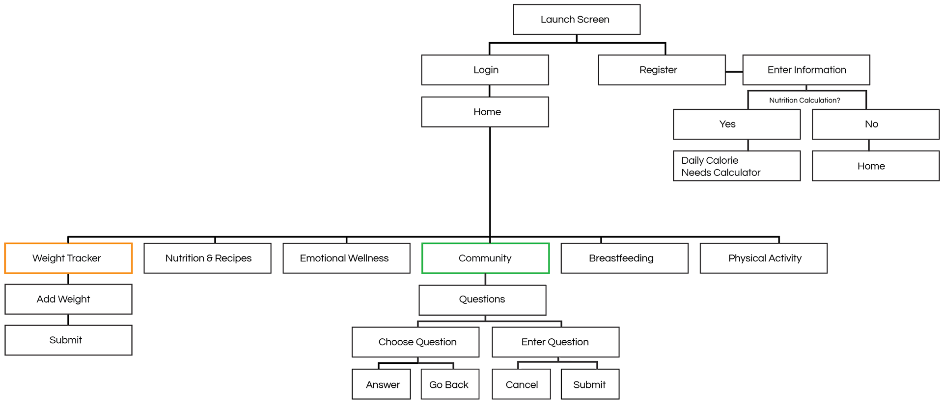
Revised Sitemap
Due to time constraints, I decided to focus on two features which I thought were the most valuable for this app. In order to create a safe space for women to want to lose weight (feature #1), there should be a good sense of community (community #2) for them to ask or answer any questions during this significant chapter of their lives.
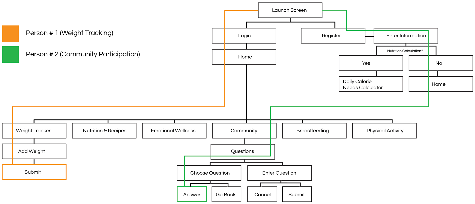
Revised User Flows
With emphasis on two key features: Weight Tracker & Community
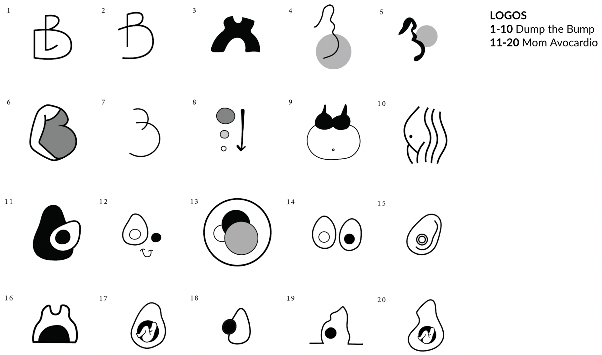
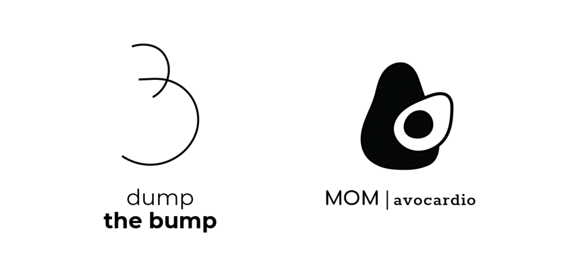
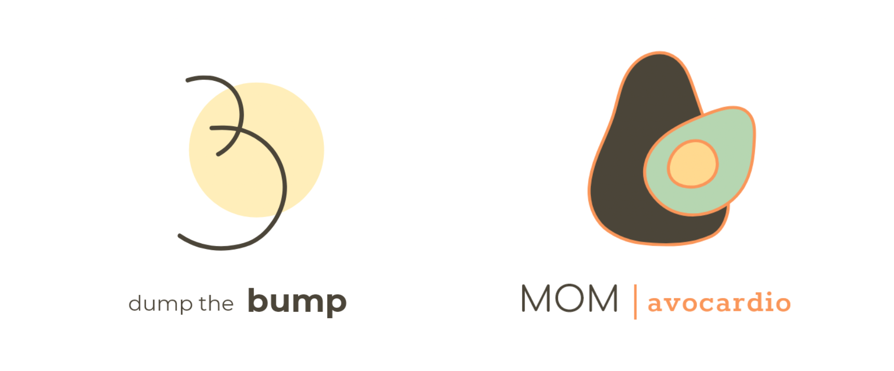
Rebranding "Dump the Bump"
Although "Dump the Bump" means to lose weight after pregnancy, it is possible that at first glance on the App Store, people may get the wrong idea as to what this app is really about. That is why I decided to come up with a variety of potential names to rebrand the app logo and overall aesthetic.
Some potential logo names included:
1. Circle Loss
2. Slim Bump
3. Mom Avocardio
4. Bump Focus
5. Post-Seed
Some potential logo names included:
1. Circle Loss
2. Slim Bump
3. Mom Avocardio
4. Bump Focus
5. Post-Seed
I decided to go with "MOM avo-cardio" because it allowed me to create a story (using an avocado as the main character) with the user interface while also providing a friendlier and more fun way to motivate mothers into losing weight postpartum.
Logo Mark Variations
Logo Type Variations
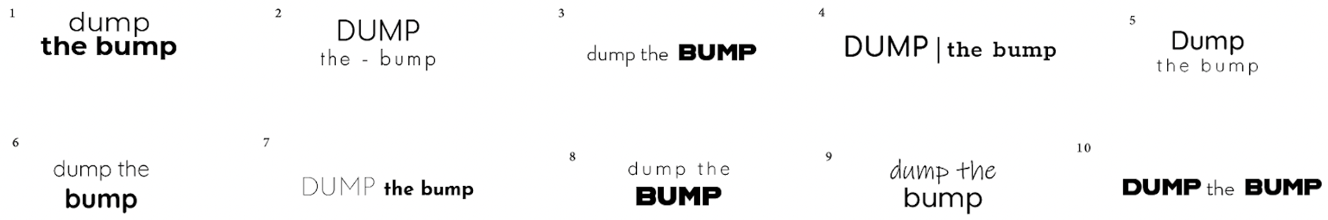
1-10 Dump the Bump
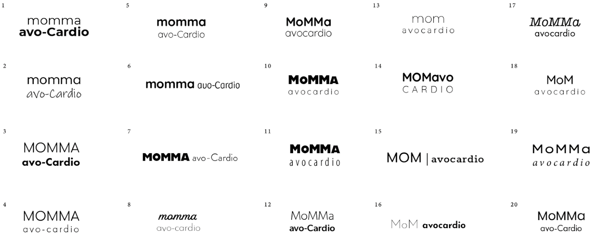
1-20 MOM avo-cardio
Logo Mark & Type
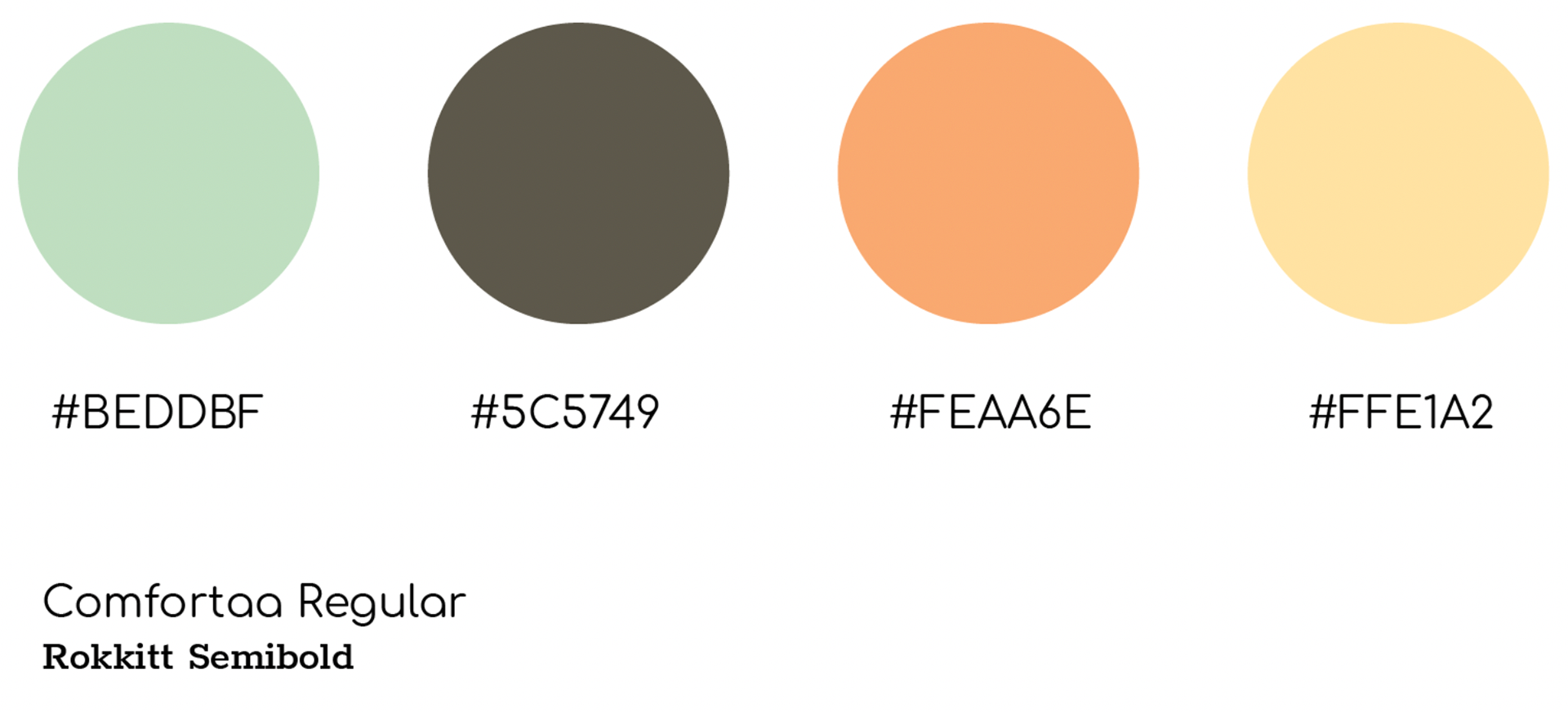
Color Scheme & Type
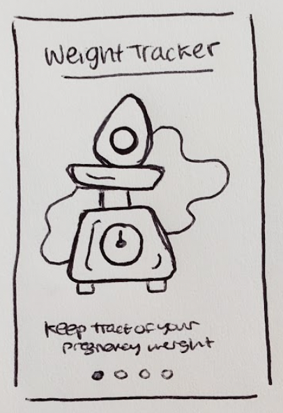
Wireframing
Low-Fidelity introduction panel sketches.
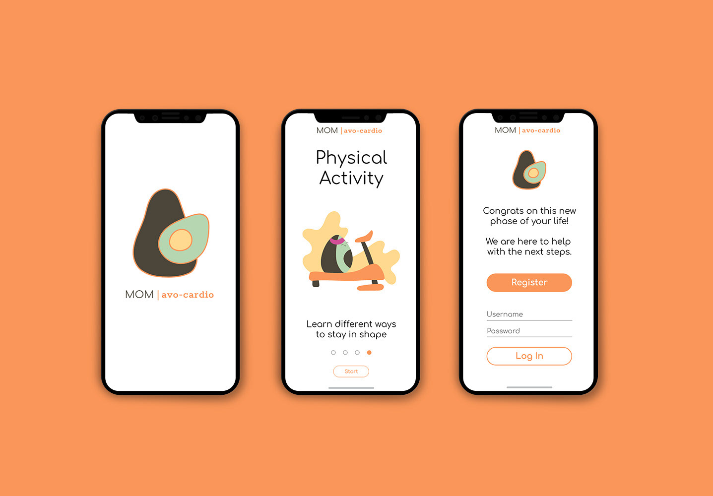
High-Fidelity Intro Panels